Blog: Brilliant light a unique art collection at Hever Castle
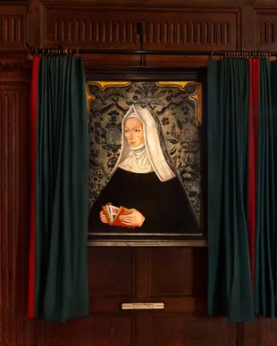
The team finalise preparations for the launch of the Tudor exhibition at Hever Castle and fine tune the lighting.
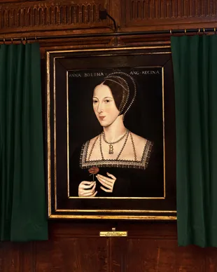
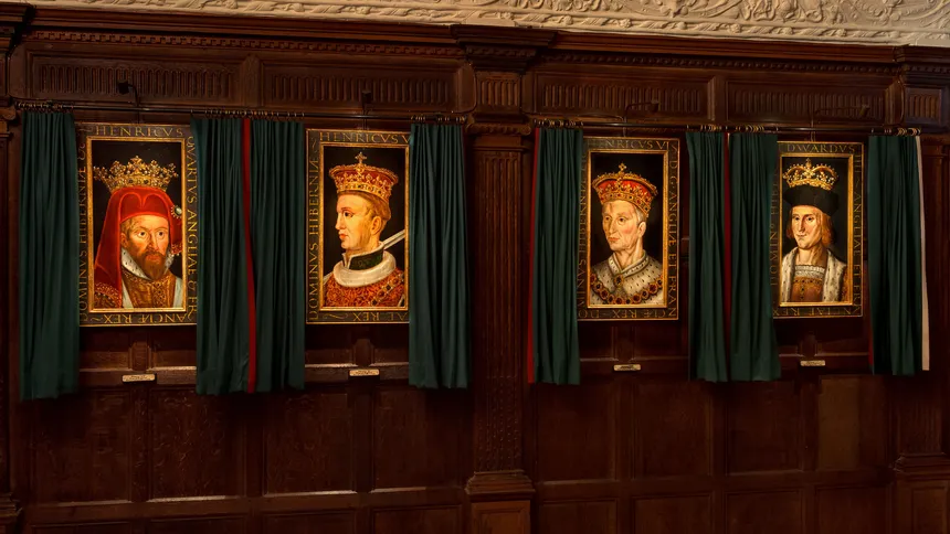
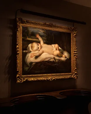
If your art looks slightly dull at night, a bit flat, a bit “off”, not as alive as it does in daylight or even barely there, it’s rarely the artwork. It’s almost always the lighting.
In many beautifully designed homes, artwork is simply left to the general lighting in the room: a ceiling downlight nearby, a table lamp across the space, or whatever ambient light happens to reach the wall. The room may feel bright enough, but the art itself still lacks presence. Colours can feel muted, texture can disappear, and pieces that feel full of life during the day can quietly fade into the background after dark.
The good news is that you don’t need to turn your home into a gallery to achieve impactful results. In fact, the best residential art lighting should feel natural, comfortable and integrated into the room. It should bring the artwork forward without making the space feel stark or overly staged.
Whether you are lighting a single favourite piece, a collection, or artwork as part of a wider room scheme, the same principles matter most: quality of colour rendering, focus and control.
Colour rendering quality is what allows artwork to look believable under artificial light. In simple terms, colour rendering describes how accurately a light source reveals colour compared with a natural reference such as daylight. Daylight is broad and balanced, which is why paintings, prints and textiles often look right during the day. Poorer-quality indoor light can shift those relationships: reds can appear dull, whites can look dingy, blues can lose depth, and subtle tonal differences can flatten.
Good colour rendering helps restore that richness. Neutrals look cleaner, colours feel more faithful, and the nuance in the artwork becomes easier to appreciate.
Focus is just as important. Lighting art well is not the same as making the whole room brighter. A room can be perfectly well lit and still do very little for the pictures on the wall. Dedicated art lighting allows the light to be directed towards the artwork itself, so the piece becomes a point of interest rather than simply part of the background.
Then there is control. The best results come from being able to manage where the light goes, how wide the beam is, and how bright it feels. Too little light and the art disappears. Too much and the wall can feel harsh or overworked, and if too much light over time, it will damage the artwork. The aim is not maximum brightness, but the right level of illumination for the artwork, the wall and the atmosphere of the room.
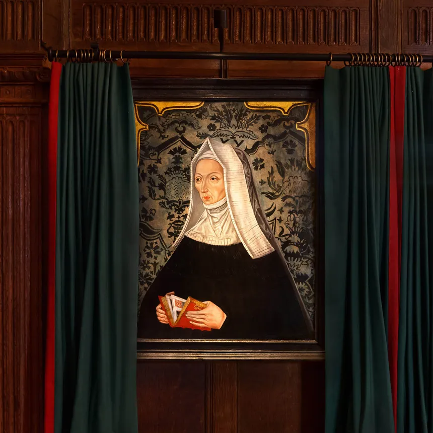
There are two main approaches in residential settings: picture lights and ceiling-mounted downlights. Both can work beautifully, but they do different things.
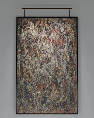
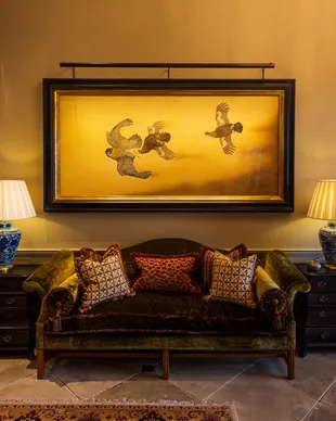
A picture light is often the most direct and elegant solution, particularly for individual pieces. It creates a clear relationship between the artwork and the light source, and can add a sense of intention without needing to alter the whole ceiling layout. This can be especially useful in existing homes, where changing downlight positions or adding downlights may not be practical or desired.
When choosing a picture light, proportion matters. The fitting should feel balanced with the width and style of the artwork, and the light should spread comfortably across the piece rather than creating a narrow bright strip or leaving the lower section underlit. The depth of the frame, the height of the artwork and the wall finish can all influence the right choice.
A good picture light should also feel visually quiet. It should support the artwork, not compete with it. The most successful fittings tend to combine excellent colour rendering, controlled output and careful optical design, so the art is illuminated cleanly while the room still feels warm and residential.
Downlights can also be very effective, particularly where artwork forms part of a wider architectural lighting scheme. Adjustable downlights allow light to be aimed towards a wall or individual piece, and they can work well in rooms where a clean ceiling detail is preferred.
The challenge with downlights is that they need to be considered as part of the room, not just as a quick fix for one picture. Their position, beam angle, adjustability and dimming all influence the result. If a downlight is too close to the wall, too far away, too broad, too narrow, or not adjustable enough, the artwork may still feel unevenly lit. In some cases, the room will feel bright but the art will not have the emphasis it deserves.
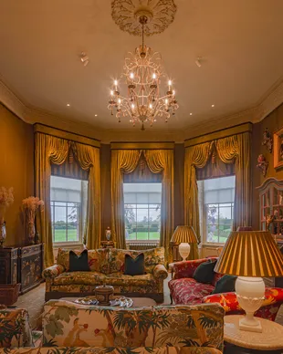
This is why art lighting is usually most successful when it is considered as part of the whole space. How the room is used, where people sit, where the main views are, what other lighting is present and how the artwork relates to the furniture all affect the final result.
There are a few mistakes that come up again and again. The most common is simply not lighting the artwork at all and expecting general room lighting to do the job. Another is relying on fixed downlights that were never positioned or circuited with the art in mind. Over-lighting can also be an issue, making the wall feel too bright or uncomfortable and flattening the artwork, while inconsistent colour temperatures across a wall can make a group of artworks feel unsettled.
Reflection can occasionally be a factor, particularly with glazed artwork or strong daylight sources, but it is only one part of the jigsaw. In a lived-in home, artwork may be viewed from several positions: standing, sitting, passing through a room, or relaxing on a sofa. A solution that is perfect from one viewpoint may not be perfect from every angle. The priority should be a balanced, comfortable result that works well within the room as a whole.
At Brilliant Lighting, we approach art lighting by starting with the outcome: helping the artwork feel more present, more accurate and more considered, while keeping the room comfortable and inviting. Sometimes that means a carefully selected picture light. Sometimes it means adjustable architectural lighting as part of a wider scheme. Often, it is about finding the right balance between the artwork, the room and the way the space is actually lived in.
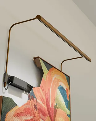
Where a picture light is the right solution, ArtView II is designed to provide precise, controlled illumination with excellent colour quality, allowing the artwork to become the focus without the lighting feeling intrusive.
If you are planning a room, a whole-home lighting scheme, or would like advice on choosing the right picture light for a specific artwork, we can help you create a result that feels refined, comfortable and beautifully integrated, without turning your home into a gallery.