Blog: Brilliant light a unique art collection at Hever Castle
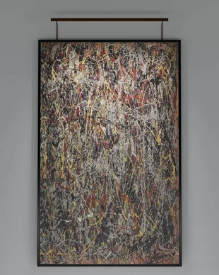
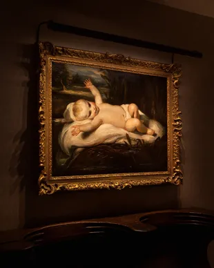
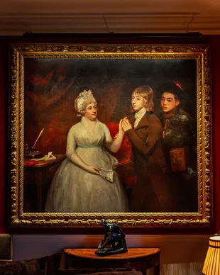
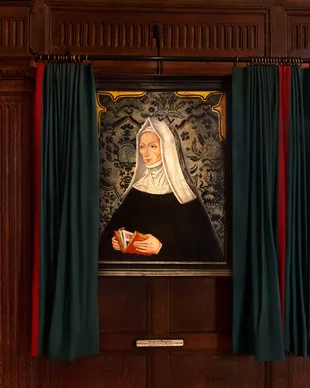
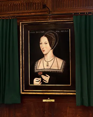
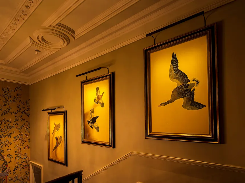
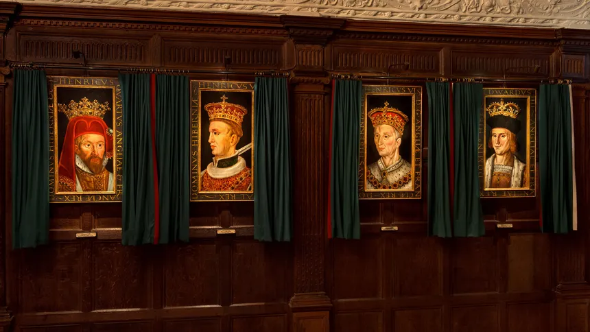
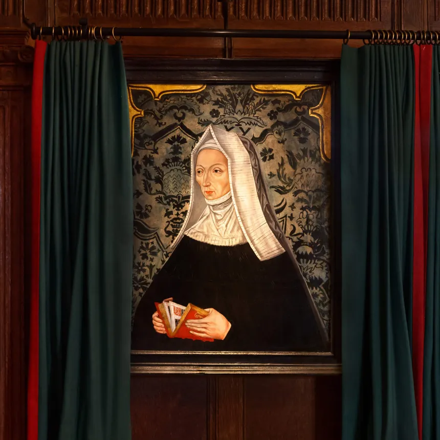
The team finalise preparations for the launch of the Tudor exhibition at Hever Castle and fine tune the lighting.
You hang a piece of art you love, you step back, and in daylight it looks exactly as it should. Then evening comes, you switch the lights on, and something feels… off. The colours shift. Skin tones in portraits look flatter. Whites look slightly grey or slightly yellow. Blues can feel dull. Reds can feel too strong. The artwork hasn’t changed, the light has.
This is one of the most common quiet disappointments we see in beautiful homes. It’s usually not the artwork at all, but the artwork lighting: the colour quality of the light source, the beam, and the way glare is controlled. The good news is that it isn’t mysterious, and it’s absolutely fixable once you know what to look for.
We tend to think of colour as something that belongs to an object. In reality, colour is what your eye and brain perceive when light hits a surface and reflects back to you. Change the light, and you change what wavelengths are available to be reflected, so your perception changes.
Daylight is broad-spectrum and dynamic; it contains a wide range of wavelengths. Many artificial light sources are more selective, even if they look white at a glance. That selectivity is what can make artwork appear different at night, even in the same location.
“Colour rendering” is the lighting industry’s way of describing how faithfully a light source reveals colours compared with a reference. You’ll often see this summarised as CRI (Colour Rendering Index), usually a number out of 100.
CRI can be a helpful starting point, but it’s not a guarantee of beautiful colour. Two light sources can share the same CRI and still render certain pigments very differently. Artwork is also a particularly demanding test: saturated paints, subtle tones, varnishes, and textured surfaces can highlight weaknesses in a light source quickly.
In practice, what matters is simple: does the light make the artwork look natural, nuanced and dimensional, the way you expect it to look?
There are a few recurring reasons artwork loses its life in the evening.
The spectrum is missing something the artwork needs. Certain LEDs under-deliver on specific colour ranges. The result can be muted blues, odd greens, or reds that feel slightly artificial. You might not notice this on a plain wall, but a painting will reveal it immediately.
The colour temperature isn’t coordinated with the room. If the room is predominantly warm (timber, warm paints, brass), a cooler light on the artwork can make it feel detached. If the room is cooler and crisp, a very warm light can make whites in the artwork look aged or yellowed. It’s less about a right Kelvin number and more about consistency and intention across the space.
Glare reduces perceived colour and contrast. If you can see the light source or its reflection, your eye adapts to the bright point and the artwork can lose contrast. The colours are still there, your visual system is just working harder, and the piece reads as flatter.
The beam is wrong for the size and finish of the piece. Hotspots can bleach out sections of a painting, while an overly wide beam can wash everything evenly and remove the sense of depth. Glossy finishes can also create specular reflections that mask colour.
When we light artwork well, we’re balancing three things: colour fidelity (the pigments look believable and rich, not shifted or dulled), visual comfort (no glare, no distracting reflections), and modelling (the piece has shape and presence, not a flat rectangle on a wall).
That’s why art lighting is never just add a light. It’s a small design exercise involving light quality, optics, position, and how the viewer will experience the piece from different points in the room.
If you’re wondering whether your lighting is helping or hurting your artwork, a few simple signs tend to show up. The piece looks better in daylight than it does at night and not just different, worse. Whites can read slightly grey, yellow, or oddly pink under artificial light, while blues may feel muted or heavy. You might notice reflections of fittings or windows across the surface, or the opposite problem: parts of the artwork look washed out with a hotspot while other areas feel dull.
If any of those are true, it usually means the light source, aiming, or optics need refining, not that the artwork is hard to light.
In our projects, we treat artwork as part of the interior architecture, not an afterthought. That means we consider art locations early, then design the lighting so it feels integrated and calm.
Typically, that means choosing light sources with the right colour quality for the palette and art, coordinating colour temperature so the artwork belongs in the room, selecting optics that suit the size, finish, and viewing distance, positioning and aiming to avoid glare and reflections, and then commissioning and fine-tuning on site so the final result matches the intent.
It’s worth saying: the last 5% matters here. A small change in angle or beam can be the difference between a piece looking simply lit and looking quietly exceptional.
If your artwork looks different at night, it’s not your imagination, it’s physics and perception. The light source’s colour quality, the colour temperature in context, glare control, and beam distribution all shape how colour is revealed.
When those elements are handled with care, artwork holds its colour and presence from day to night, and the whole room feels more coherent because the palette reads properly.
What CRI is best for artwork lighting?
As a rule of thumb, aim for high colour quality (often advertised as CRI 90+), but don’t treat the number as a guarantee. Two LEDs can share the same CRI and still make certain pigments look different. If colour accuracy really matters, test the light on the actual artwork.
What colour temperature should you use to light a painting?
Choose a colour temperature that suits the room as a whole. In warmer interiors, excessively cool artwork lighting can feel detached; in crisp, cooler schemes, very warm lighting can make whites look aged. Consistency across the space is usually more important than chasing a perfect Kelvin number.
Why do paintings look different under LED lighting?
Because some LED spectra under-represent certain wavelengths. That changes what the surface can reflect, which changes what you perceive, especially in saturated paints and subtle skin tones.
How do you light artwork without glare?
Start with careful aiming and a concealed light source, then refine beam angle and accessories (where appropriate) so the viewer doesn’t catch the source or its reflection. Small changes in position can make a big difference.