Blog: Fine-tuning the lighting in a Victorian villa ahead of completion
Fine-tuning the lighting, blinds and control in a Victorian villa ahead of completion and handover
Lighting is often discussed in numbers: wattage, lumens, lux, kelvin. Those metrics matter. They support safety, compliance, and performance. They help us avoid under-lighting a worktop or over-lighting a bedroom. But they do not explain why two rooms with similar measured brightness can feel radically different - one calm and quietly luxurious, the other harsh, flat, or visually noisy.
The difference is rarely “how much light”. It is what the light is doing in the space. That is why fixture selection is not a finishing touch; it is a design decision that shapes perception.
When you specify a luminaire, you are deciding what becomes visually important, where the eye is drawn, how materials read, how people’s faces look, how comfortable the room feels, and how the mood changes from day to night. In other words, you are choosing an experience.
Throughout this piece we’ll look at one concept: creating light layers. Layering is often described as a formula - ambient, task, accent - but in practice it is more useful to think of a layer as a role in the composition. A layer is a job, and fixture selection is how you choose the right tool for each job.

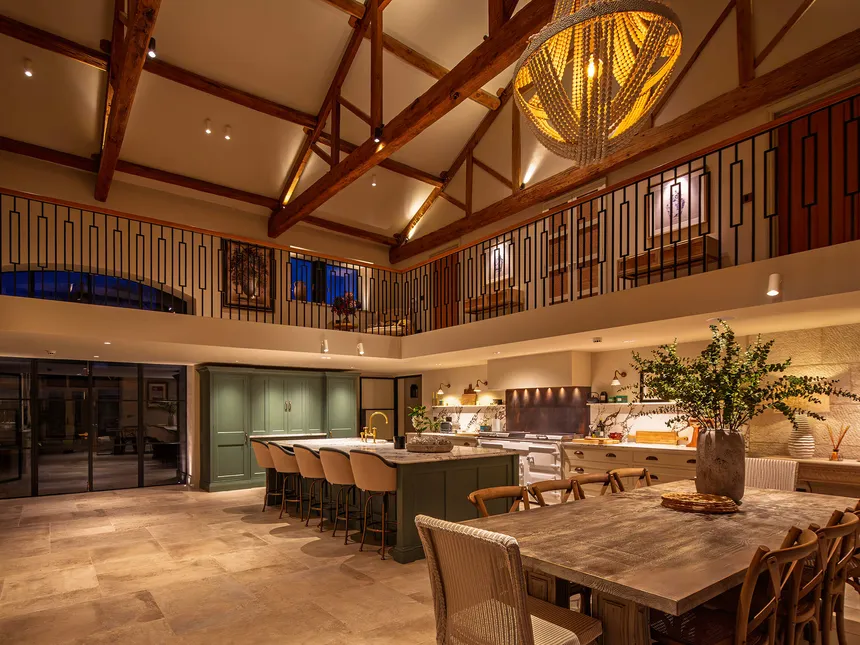
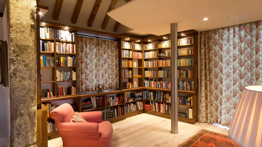
A general ambient layer provides baseline comfort and navigation. Done well, it does not dominate the ceiling or fill the room with glare; it simply makes the space easy to inhabit. A task layer adds purposeful brightness where precision matters: kitchen worktops, desks, mirrors, reading positions. An accent layer introduces hierarchy by placing light on a few meaningful elements: artwork, joinery, texture, planting, architectural details. A vertical layer lifts walls and key planes, which is one of the fastest ways to change perceived spaciousness. Decorative light can add identity and rhythm, but it must be integrated so it does not fight the technical layers. Finally, low-level guidance lighting makes night-time movement feel welcoming and safe.
You do not need every layer in every project. But if you ignore the concept entirely, you tend to use one blunt instrument - often downlights - to do every job. That is how many schemes become flat, over-bright, or uncomfortable.

A better starting point is intent. Before product, write down what the space should feel like and how it should behave. Is the mood calm and restorative, crisp and energising, intimate and warm, or dramatic and sculptural? Where do people gather, pause, and move? How does daylight enter and change through the day? Which materials are matte and which are reflective? Which surfaces carry the architectural story? These questions are not soft or optional; they translate directly into specification choices.
If the intent is calmness, you will prioritise glare control, softer distribution, and comfortable low-level dimming. If the intent is drama, you will use contrast, tighter beams, and deliberate darkness so the bright areas have meaning. If the intent is flexibility, you will think early about scenes and about fixtures that behave well when dimmed.
To see why fixture selection shapes perception, it helps to break down what a fixture actually does. A luminaire is not just a container for an LED. It shapes light through distribution, control, and character.
Distribution is easiest to visualise: where the light goes and how it spreads. A wide distribution can make a space feel open and relaxed. A narrower distribution increases contrast and focus, which can feel precise and curated when used intentionally. Control is about how cleanly that distribution is delivered. Better optical control reduces spill, limits unintended hotspots, and protects sightlines from glare. It also allows clarity with fewer fittings, because each fitting does more of the right work and less of the wrong work. Character is how the light feels in use: the softness of beam edges, the smoothness of fall-off, dimming quality, colour consistency, and how it renders materials and skin tones.

One of the most overlooked levers in spatial experience is vertical illumination. Many lighting plans over-emphasise light on the floor or horizontal workplane and under-emphasise the surfaces people actually look at. Humans read rooms through walls, joinery, shelving, artwork, and the faces of others. When these surfaces are dull, a room often feels smaller and less inviting - even if the lux levels on the table are technically “correct”.
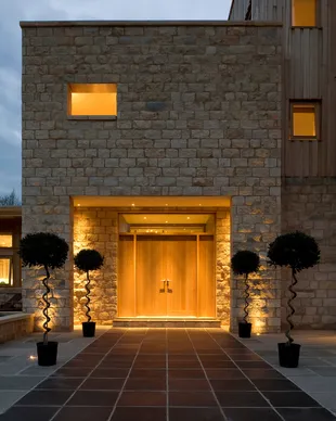
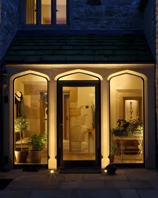
This is where fixture selection makes a visible difference. A true wall-washing optic is designed to deliver even vertical light with minimal scalloping and glare. The effect can be quietly transformative: the room feels broader and calmer, and the architecture becomes legible. Adjustable spotlights can also light walls, but they demand careful aiming and tend to produce more contrast. Concealed linear lighting can lift walls softly when placed and diffused well, creating a gentle glow that supports a relaxed mood. The point is not that one approach is always right; it is that vertical light is a layer with a specific job, and it needs a tool chosen for that job.
Downlights deserve their own discussion because they are so often treated as the default. Downlights can be excellent when used intentionally: a restrained baseline, circulation support, targeted task light. But they cause problems when asked to do everything. Over-reliance can increase contrast, introduce glare in critical sightlines, flatten the ceiling with a grid aesthetic, and pull attention to the floor rather than the architecture. In many spaces, a more design-led approach is to use downlights as a baseline where they genuinely help, then rely on vertical and accent layers to create the experience.
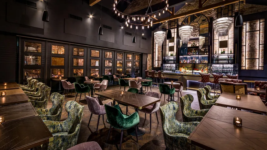
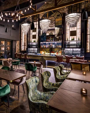
Accent lighting is one of the most effective ways to introduce depth - a hallmark of well-designed spaces. Depth comes from hierarchy: something is clearly important, something supports it quietly, and darker zones exist so that bright areas have meaning. Accent light can reveal artwork, texture, and joinery craft. But it can also create visual noise if everything becomes a focal point. Good accent design is selective: fewer highlights, more clearly delivered.
Here, optical control matters. Controlled beams place brightness where it is wanted without spill that makes the scheme messy. Beam angle decisions directly influence focus. A tight beam increases drama and contrast, which can be beautiful on sculpture, art, or textured materials. A wider beam can feel more relaxed and forgiving, especially on larger surfaces or in minimal interiors. Surface reflectance matters too: glossy finishes can produce uncomfortable highlights unless directionality and intensity are managed carefully, while matte finishes often benefit from a little more shaping to avoid looking flat.
Glare is the fastest way to undermine a scheme, even when measured illumination is technically correct. People often describe glare as “too bright”, even when overall levels are not excessive. The discomfort comes from high luminance sources in the field of view and unmanaged contrast. Glare is shaped by fixture selection and placement. Shielding and cut-off determine whether you can see the source from common positions - seated on a sofa, standing at a kitchen island, looking into a mirror. Optical quality affects whether beams have smooth gradients or harsh edges. Placement relative to sightlines determines whether fittings become a constant visual distraction. Managing glare is not just about comfort; it is about letting the rest of the design read as intentional.
Fixture selection also determines how materials and textures are revealed. Lighting can make a surface feel tactile and dimensional - or flatten it. Grazing is a powerful technique: a linear source or carefully positioned luminaire close to a textured surface can reveal grain, relief, and shadow, bringing timber, plaster, stone, or brick to life. Conversely, a softer wash can calm a surface and reduce visual busyness, which may be exactly what the space needs. The fixture and optic determine what is possible.

Colour quality and warmth influence experience too. Colour temperature is a starting point, but it is not the whole story. A scheme can be “warm” on paper and still feel dull if colour quality is poor or inconsistent. People notice this most in skin tones, timber, and soft furnishings. Consistency across fixtures matters as well; if one area renders materials differently, the space can feel disjointed even if everything is nominally the same kelvin.
Layering becomes most powerful when it is controllable. Controls tie the layers together by allowing the composition to change through the day and across activities. Without controls, many spaces default to “everything on”, which often feels bright but not comfortable. With scenes, you can reduce overall brightness while keeping focal points, shift from working to evening mode, and introduce a gentle night-time pathway without waking the whole room.
A practical approach is to define a small set of scenes that map to real life. A day/working scene might keep ambient and task layers higher while maintaining glare control. An evening/relaxed scene might lower the ambient layer, keep vertical light soft, and let accents provide depth. An entertaining scene might lift vertical light slightly for openness while keeping focal points active. A night scene might rely on low-level guidance and minimal spill. Some projects benefit from a cleaning/full-output scene, but it should not be the default.

Controls only work as well as the fixtures allow. Dimming performance varies widely. Some fittings behave smoothly and predictably at low levels; others drop out, flicker, or shift colour. If you care about evening atmosphere, dimming quality is not optional - it is part of the specification.
This leads to the broader mindset shift: specification is not a list; it is a composition. It is tempting to search for one luminaire that “does it all” because it feels efficient. But most successful schemes are built from a small set of fixtures, each chosen to do a specific job well. A low-glare baseline supports comfort. Vertical light shapes volume. Accents create hierarchy. Task light supports performance. Low-level guidance supports night-time behaviour. Decorative light adds identity. When those roles are clear, the product list becomes simpler - not more complex - because every item has purpose.
If you want a repeatable way to choose fixtures by layer, begin by defining the experience in plain language. Write three to five adjectives that describe the intended mood. Then decide what your baseline should be and how to deliver it without glare. Identify the key walls or planes that will shape perceived spaciousness and decide how to light them well. Choose a small number of focal points that deserve emphasis and specify controlled accent lighting for them. Add task lighting where activity demands it, and low-level guidance where you want evenings and night-time movement to feel gentle. Finally, decide how these layers combine in a handful of scenes.
The outcome you are aiming for is not more light. It is the right light in the right place, with the right character.
Fixtures are the vocabulary of light. When fixture selection is treated as procurement, lighting becomes generic. When fixture selection is treated as design, lighting becomes a tool for spatial storytelling - making the space more comfortable, more legible, and more intentional, because it is built around experience, not just illumination.