Blog: When to involve a lighting designer
Lighting design needs to be considered early in a design project. Lighting plans should be developed alongside architectural and interior design plans
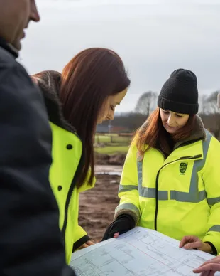
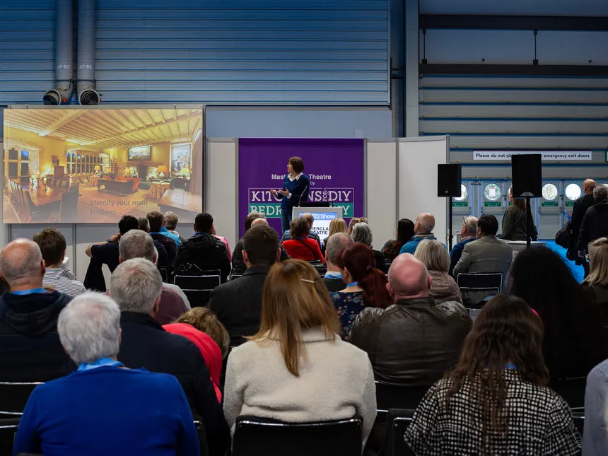
Brilliant Lighting has been exhibiting at the Homebuilding & Renovating Shows since November 2004 when we did our first Harrogate show. Since then we've done every Harrogate show and exhibited regularly at the National Show at the NEC with the odd show at Excel in London. As well at giving us the opportunity to meet lots of pople with live projects on the go, we've also run a series of successful lighting design Masterclass sessions at both Harrogate and the NEC.
This year's talk was entitled "Inspirational Lighting Design…. and Five Mistakes to Avoid". It's a session that fits well into the tweny minutes format of the Masterclass format. The focus is on practical tips on how get your lighting design right and avoid some of the mistakes we most commonly see.
We talk a lot about key principles in lighting design across this site so having just run this masterclass, we thought we spend a bit more time looking at the common pitfalls and the things you can do to avoid them.
Consider this picture. It's an AI generated image rather than a real photo but we've seen many interiors that follow a similar pattern. A grid of downlights that bear no relation to the space they're lighting or how the space is used. If anyything, the AI image shows a better design than some of the photos in our private internal rogues gallery. There are other things happening with the lighting and the cove and the (possibly impossible) linear light in the window do talk to the architecture to a degree. That said, the design is characterised by a massive grid of downlights and we see that a lot.
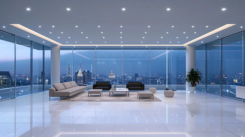
It's easy enough to see how lighting and architecture can become separated. If the space at the time the lighting design is done is still a blank canvas, a shell without any detail on how the space is going to be used, then there is little to hang the design off. It's most commonly seen in residential property developments where the space is sold lit but as an empty shell. Small wonder people rail against boring lighting design.
It doesn't need to be that way in your own house and that's why our detailed lighting design process starts with defining uses & needs and identifying the main features (along wth the problem areas) of the space we're designing the lighting for. Having a proper understanding of how the space is going to be used makes the lighting design much more tangible.
This is one of the hardest things to explain. When we talk about poor quality light fittings, we're not simply about build quality although build quality is important. The factors we take into consideration on any fittings include build quality but also some less obvious characteristics. We look for reliability and properly tested measures of life expectancy, we look for consistency of colour temperature; the best fittings should look identical and continue to look identical over time. Most importantly and possibly most difficult to explain, the best fittings should deliver as accurate colour rendering as possible. That means the light should bring out the natural colour of the things it is lighting without introducing its own colour tint to it. This is a problem we didn't really have in the days of halogen but it's critical in the age of LED.
If you visited us on the stand at the NEC, you might have seen the demonstration of the saturated red bag under different light sources. It has to be seen to be fully understood but once you're aware of the importance of accurate colour rendering, you'll never look at LED light in the same way again. Good quality LED lighting is transformational.
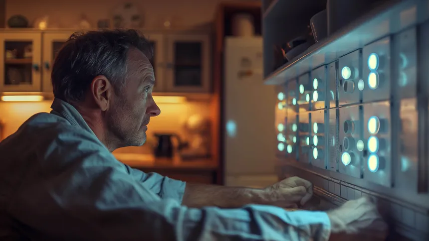
It takes the twisted genius of AI (in this case it's Midjourney) to come up with as hideous a control interface as this. In the real world, some lighting controls manufacturers can come up with some really horribly unintuitive interfaces. Even if you're using completely conventional control, a bank of 12 identical rotary dimmers isn't exactly easy to understand.
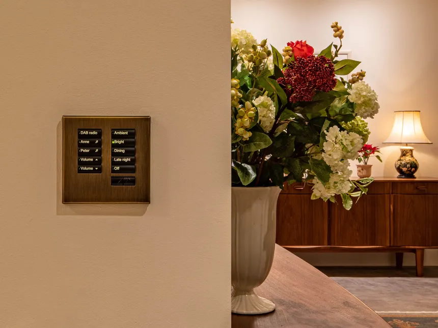
We prefer to make things simple. We use lighting control systems because they make great lighting easier to use and Lutron keypads offer genuinely intuitive control. They're backlit so you can see them in the dark when you need to. They're engraved so you can see what you are asking the control system to do. They're lovely and tied to a great lighting design they make the whole system a pleasure to use.
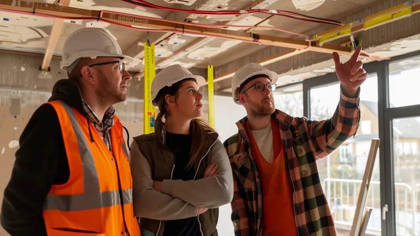
You wouldn't expect to start thinking about your kitchen design, the day before your kitchen fitters are scheduled to be on site. The same is true of lighting, lighting design and your electrical team. You need to be planning your lighting design and all the things it requires well before electricians are first fixing. First fix is a time to execute your lighting plans; the cables going into the walls, ceilings and floors (make sure you do this ahead of your underfloor heating going in) are your lighting design. That cabling is the infrastructure for your lighting scheme so plan for it early and you'll have a less stressful build.
We get that budgeting for lighting and lighting design is not easy. Budgeting for any element of your build is not easy. Our design process is structured to give a good early view of projected costs for the lighting design, fittings, lighting control (if appropriate) and the early design work matches concepts with their associated costings. We're strong believers in "no surprises" so if you'd like help with any of the issues discussed in this post, please give us a call using the contact details at the bottom of the page.
We're doing our next show at the Homebuilding & Renovating Show in Harrogate. That's the first weekend in November and we'll post more details of the show and what we're doing there nearer the time.
I wanted to see if I could create the imagery for a whole post using AI generated images. I want to be completely clear about where we've used AI because across the rest of the site we don't. All the photography we use on this site is ours and of our work, unless it's specifically stated that it isn't.
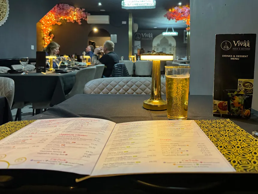
Even here in a post discussing design principles, it proved easier to use our own actual photography for certain shots because sometimes you need a very particular image of something and AI can only give you an approximation. Midjourney can't give me a picture of Mel delivering our lighting design Masterclass at the NEC, it's not going to give me a real Lutron seeTouch keypad in situ in one of our projects and it's not going to give me this last image either. This post was partly written in the Vivaa restaurant in Meriden. I got there just after eight o'clock on the Sunday night, the closing night of the show, after a three hour stand breakdown. I started writing the outline of the post over a beer.
Consider the focal points, consider what makes this view look great and then light it. Cheers.
